Your AceDraft Dashboard: Finding and Managing Your Resumes
 Gowri Shanker·Sep 29, 2026
The dashboard is where your saved resumes live, and it's a plain screen: a list, a search box and a few counters. Three rough edges, before you find them yourself. The search waits a second and a half before it does anything. The three-dot button on each card does nothing yet. And the filter for drafts and paid resumes is switched off in the code.
Key takeaways
- Signing in lands you here, and so does going to
/pro_areawith nothing after it. - Each card shows Draft or Paid, an ATS score bar, a role, a company and when you last edited it.
- Press Open, not the card. Open takes you to that resume's detail page, not the editor.
- Limitations: laggy search, a dead three-dot button, and no way to filter by Draft or Paid.
Prerequisites. You need to be signed in and to have saved at least one resume. With none, the grid just tells you that you have no resumes yet.
How do I get to my dashboard?
Sign in and you land on it. Going to /pro_area with nothing after it sends you here too, and so does opening the home page while signed in. Inside the app, the Dashboard entry in the left rail and the Member Dashboard link in the top bar both come back to it.
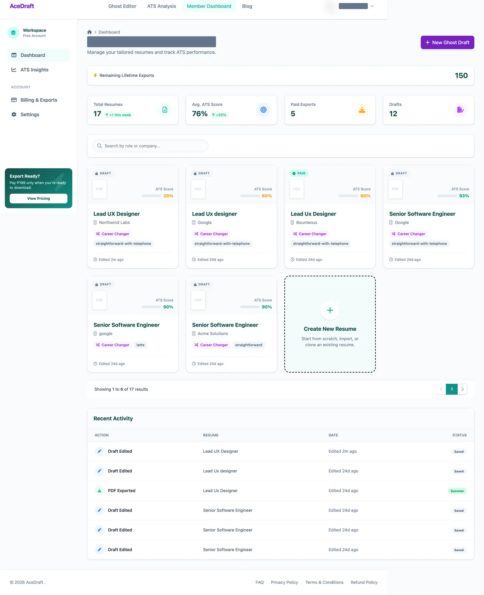 The whole dashboard on 16 September 2026. The heading and account name are masked, and the resumes are test resumes.
Heads up. Opening the dashboard wipes what your browser was holding for an in-progress resume: form answers, template choice, the staged export order. That's browser storage only, and resumes saved to your account aren't part of it. Still, don't detour through the dashboard halfway through an export.
What do the four tiles at the top count?
Your own resumes, nothing else. Total Resumes is everything on your account. Paid Exports counts the ones marked Paid, and Drafts counts the ones still marked Draft. Avg. ATS Score is the average of the scores stored on your resumes, rounded to a whole number.
 Total Resumes and Avg. ATS Score can carry a small chip comparing this week with last week.
That average is AceDraft's own score, so read it with what the ATS score does and doesn't measure next to it.
What is the Remaining Lifetime Exports strip?
A single number that only lifetime-deal and founding-member accounts get. On any other account the strip isn't drawn at all. It's read-only here, so you can't top it up from this screen.
How do I find one resume?
Type into the box that reads “Search by role or company…”. The list doesn't react until you stop typing for a second and a half. I set that wait in the code (member-dashboard.component.ts, line 90), and on 16 September 2026 I watched it: I typed “Senior”, a spinner turned in the box, and the grid underneath stayed unfiltered.
Then two things happen together. The grid narrows to your matches, and a dropdown lists them as a role title over a company name. Pick one and you jump straight to that resume's detail page, instead of narrowing the grid to it. The small cross clears the box.
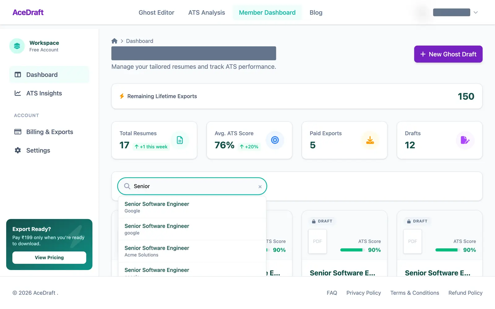 The dropdown after the wait. Until it appears, the grid behind it is unfiltered.
What's on a resume card, and where does it take me?
Six things, top to bottom:
- A pill in the top corner: Draft with a padlock, or Paid with a tick.
- An ATS Score bar. It's green from 80 up and amber below that.
- The title. That's the desired position from your form, then your full name if that's empty, then “Untitled Resume”.
- The company you typed as the one you're applying to, or the first employer on the resume.
- A tag: Career Changer when your current and desired industries are both filled in and differ, Job Seeker otherwise. Then the template name.
- When you last edited it.
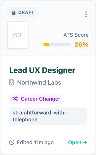 Open and the three-dot button only show up when you hover the card.
The grid shows six resumes on its first page, with previous and next arrows in a pager under it.
Hover a card and Open → appears in the footer. It takes you to the resume's detail page, where the Open in Editor and Export buttons live. The dashed Create New Resume tile and the purple New Ghost Draft button up top both start a fresh resume in the editor instead.
What is the Recent Activity table?
A log under the grid with four columns: Action, Resume, Date and Status. Editing a draft shows as Draft Edited with a grey Saved pill, and an export shows as PDF Exported with a green Success pill. Click a row and you land on that resume's detail page, the same place Open goes.
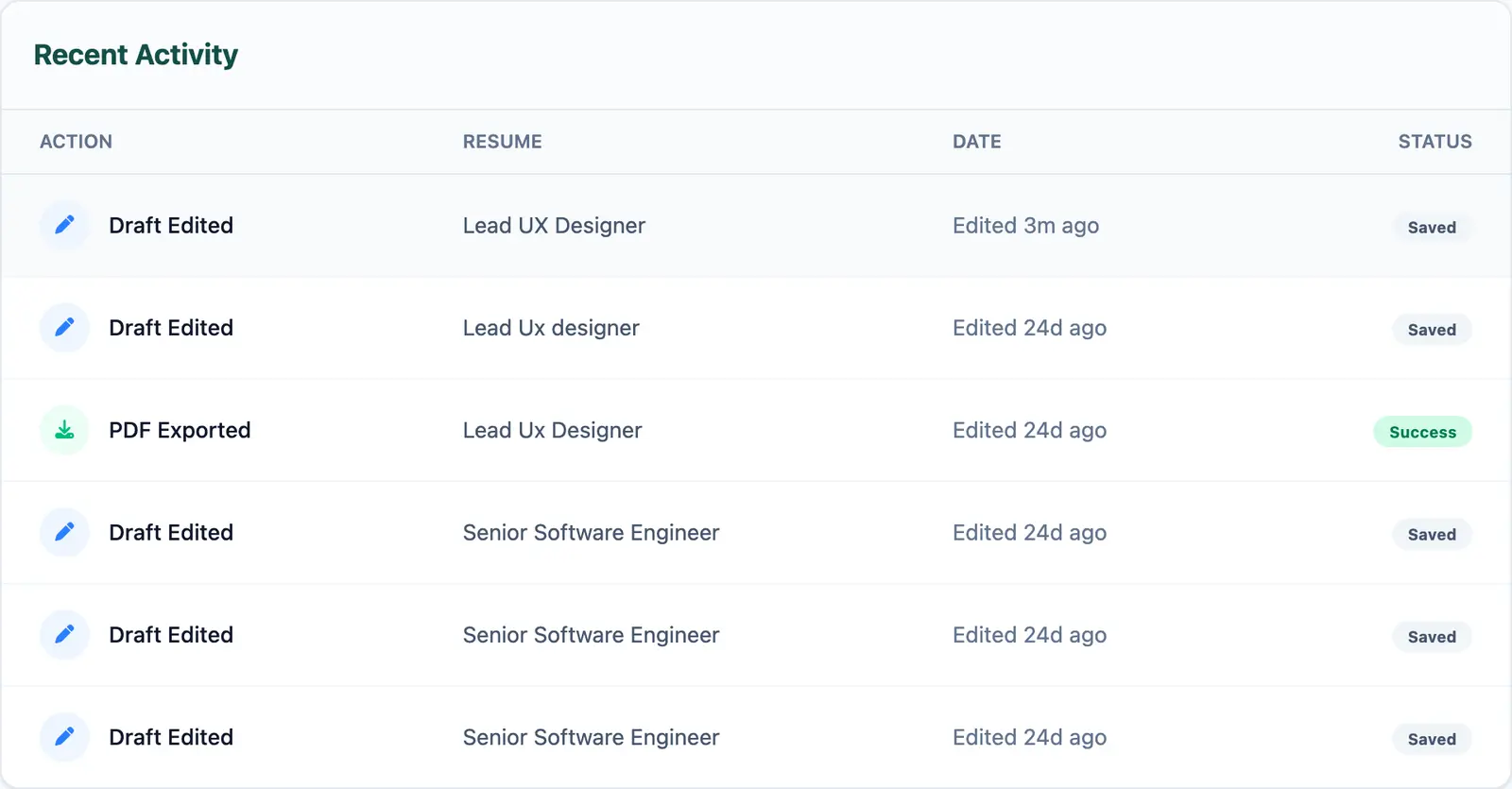 Each row names the resume and says how long ago it happened.
What doesn't the dashboard do yet?
I watched the search wait on 16 September 2026. For every other row I read the template and component code on 19 September 2026, and I haven't clicked through each one.
| Thing | What it does today |
| Search | Waits a second and a half after your last keystroke before filtering. |
| Filter by Draft or Paid | The buttons are commented out in the template. Only the search box renders. |
| Three-dot button on a card | Appears on hover, has no action attached. |
| Clicking the card body | Nothing. The card shows a pointer cursor, but only Open, the Recent Activity rows and the search suggestions navigate. |
| Open | Goes to the detail page, not straight into the editor. |
Author's take. I'd shorten the search wait first. A second and a half feels like the screen ignored you. After that I'd either wire up the three-dot button or take it off, because a button that appears on hover and does nothing is worse than no button.
Use this if you have several resumes and want to find the right one and get back to it.
Skip this if you have one resume. You'll see one card, four counters and a search box with nothing to search.
Where should I read next?
- The guest editor tutorial, for what happens once a card or the New Ghost Draft button drops you in the editor.
- A resume builder without a subscription, for how AceDraft charges.
- What the ATS score means, before you trust the average.
Comments
No comments yet. Be the first to comment.